Here's the pinnacle of the Urban Jungle
My Inspirations
Juergen Maeurer
Juegen Maeurer is a photographer I discovered on a photography social networking site for photographers; he does a various amount of photography but I really liked his black and white street life photography.
Sander's 500px page.
Sander's 500px page.
Analysis of the Photographer
|
You could say my theme is a little bit weird but I don’t care much because since many photographers do this and it looks good. For my theme I want to capture everyday life things with oblivious people captured within them. I like taking pictures of public places to see what kind of faces I can get.
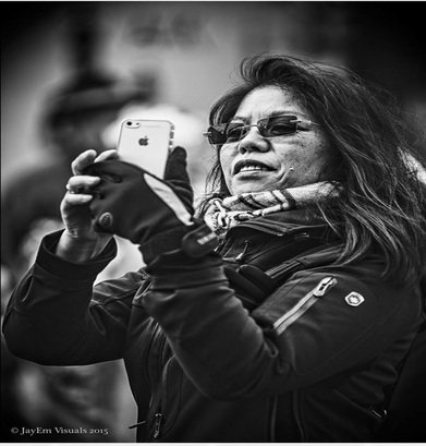
This photo here, I have chosen was taken by a photographer on 500px named Juergen Maeurer. I really like a lot of his photos because he has a lot of monochrome, everyday life photos that intrigue my eye. This photo here I picked out of the ones I found is of a woman photographing something that must be somewhat entertaining in the street. I liked this photo because the woman’s facial details were very detailed and she was the main foreground and the background was very blurred so you could see she was the main subject of the photograph. I am also a lover of monochrome photos because I believe that it’s a life saver when it comes to editing. My uncle (who is a photographer) has always said to me that black and white is always cool no matter what the photo is. When editing, if the photo is not as good as you expect it to be in its coloured version you zap it black and white, adjust the exposure, contrast and so on, then you have a saved photo! Well, back to the photo that I have chosen. Like I said with why I wanted to do this specific ‘theme’ I really enjoy capturing real life people because I think it brings you back to reality. Realising how all these kinds of people exist and have lives of their own like we do. I think it opens your eyes a little more. I appreciate the photos detail in facial features in this photograph and how well the photographer has managed to capture these important things. Blurring the background from behind enhances the foreground greatly and is a good technique to make the subject matter stand out for the audience who is viewing the photograph. The lighting is not bright, nor dark. It’s just right for the photo so the facial features do not get washed out. I can see the photographer has lightly changed the offset of the picture to calm the contrast down so it gives the photo a chill feel so it goes easy on the eye. |
|
Ronya Galka
A photographer I found when searching 'urban street photography'. I really liked their photography because they gave off an amazing feel to them and they were really pleasant to look at.
Ronya's webpage
A photographer I found when searching 'urban street photography'. I really liked their photography because they gave off an amazing feel to them and they were really pleasant to look at.
Ronya's webpage
Analysis of Photographer
|
This photos subject matter, is two people walking in the train with umbrellas, it looks like a public evening photo so I don’t think this is a staged photo. It looks as if they might be in central london due to the arcitecture of the buildings around them. There is also a black taxi to show Londons signiture taxi to give this photo a fairly trendy look about it. The background consists of more detail than the foreground as in the distance you can see more street detail. The street section in the background photo is within the deph of field.
I can see the photo has been manipulated to have a greenish, grey like filter to add to the effect and mood the photo is trying to give off. I really think the filter of this photo compliments it really well to capture an atmospere. The lighting effect is from one as the light source from the street lampswhich reflect on the wet pavement to make it look mirrored and very shiny. The pavement glistens so this gives the photo another lighting effect to give the photo a delightful look. The rest of the objects and people in the photo are fairly darker than anything else within the scene. The two people with umbrellas are so dark that they give off a sihloutte effect. The main thing I really like about this photo is the filter, scene and the feel/atmosphere it gives off. I’m sure the people in the photo do not appriciate the situation that theyre in but if they saw this photo after being photographed they could truly appreciate how charming the photo is. With the detail, lighting and manipulation. Nicholas Goodden
A fairly known photographer for his urban London work and work with various companies and celebrities. Nicholas's website Analysis of Photographer
The main aspect of this photo is a person in the rain down Oxford Street with a rain droplet, covered umbrella. The title of the photograph is named "New Oxford Street" and is a black and white photograph.
I would describe this photo as modern, fairly shiny and has a very good use of light within this photograph; the composition of the photo is in portrait and not too complicated. Its been taken this way for a simple look but that's all the photo needs. The photo has been taken on Oxford street, a rather famous street of London City but you wouldn't really notice that because there are no major landmarks. The title lets the audience know where the photographer is. The photograph is a natural photo taken at the right minute so the photographer could capture the dewed umbrella in the right setting (Oxford Street). Back to my appreciation on the lighting demonstrated in the photo. I notice that in the crowd the only large, bright object that is visible. |


The photo has been manipulated to be black and white. Perhaps Goodden has used a blur like effect to cancel out some background in the photo so the main focus is the person and their umbrella within a midst of shoppers in Oxford Street. I'd say this photo reminds me of any other day in England since its always continuous rainy weather. So anyone from a rainy area can relate to the constant wet climate.
If I were with the photographer at that moment I would be questioning him "How do you not take notice of the judging bystanders when you take photos of the public?" I find that kind of thing extremely difficult sometimes despite it being my main intention in my theme. |
My Journey to NYC/Photoshoot Plan
I went on an art and photography trip to New York City in the USA. It was a great opportunity to go so I did. While I was there, we walked to our limits and saw some amazing sights. We met some quirky people and the occasional rude person.
Over the two full days I had there I took hundreds of photos of whatever I saw; it was hard getting the risky photos in the road but I managed to not get myself ran over by a yellow taxi.
What stuck me most about NYC was that how vastly tall the buildings were. Even the buildings that were just cheap apartments were GINORMOUS. All the streets were neatly rowed and I didn't see a single curvy road! Just dozens of straight lined roads.
I once heard the saying about NYC saying that it was 'The City That Never Sleeps' and I didn't believe a word of it. Sure it was a busy city but when it got to at least three in the morning, it had to be quiet right? Wrong. I found myself waking up in between 3 and 4 am on the first night and I looked out my window to see the streets many stories below still lit up and cars were still beeping and driving around! It was so alien to me but I managed to cope with the noisy cars at night due to the exhaustion everyday.
Getting to the point of why I switched to fragments instead of disguise.
I just really like going out to interesting places and capturing people in their everyday doings mixed with some urban (but interesting) architecture.
I found that disguise was a little too hard to organize for myself as a student because of school during the week and other things to do. I'm glad I switched to fragments because that way, I can share my journey to The Big Apple with people.
Fragments of Life:
In NYC
Photos that Struck me
Analysis
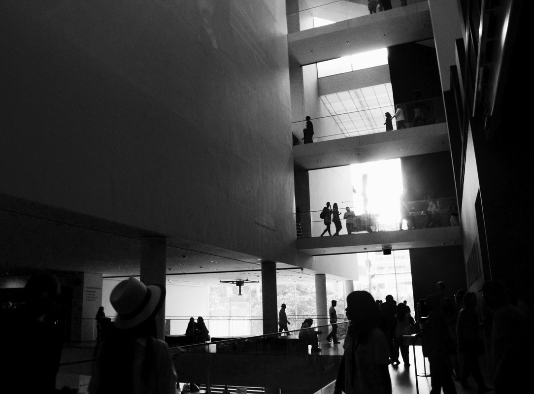
These four photos are my favourites from my NYC Fragments of Life photo shoot. The black and white photo inside a building is a photo I took in the MOMA. I think this photo looks extremely good in a monochrome filter and makes the lighting very effective in the photograph. The silhouettes and lighting in the photo makes the photo what it is. This is one of my favourites because of the transition with light to dark within it. It’s simple but effective in my opinion.
While in New York it was very busy and we were dragged around a lot to so many different places. So it was pretty hard to get the perfect, crisp photo I wanted. It was even weirder when I was taking photos on the subway because people think you’re a creepy, annoying tourist.
New York had human traffic and this was something that amazed me yet, annoyed me since there must be way too many people to be this bad and have HUMAN TRAFFIC.
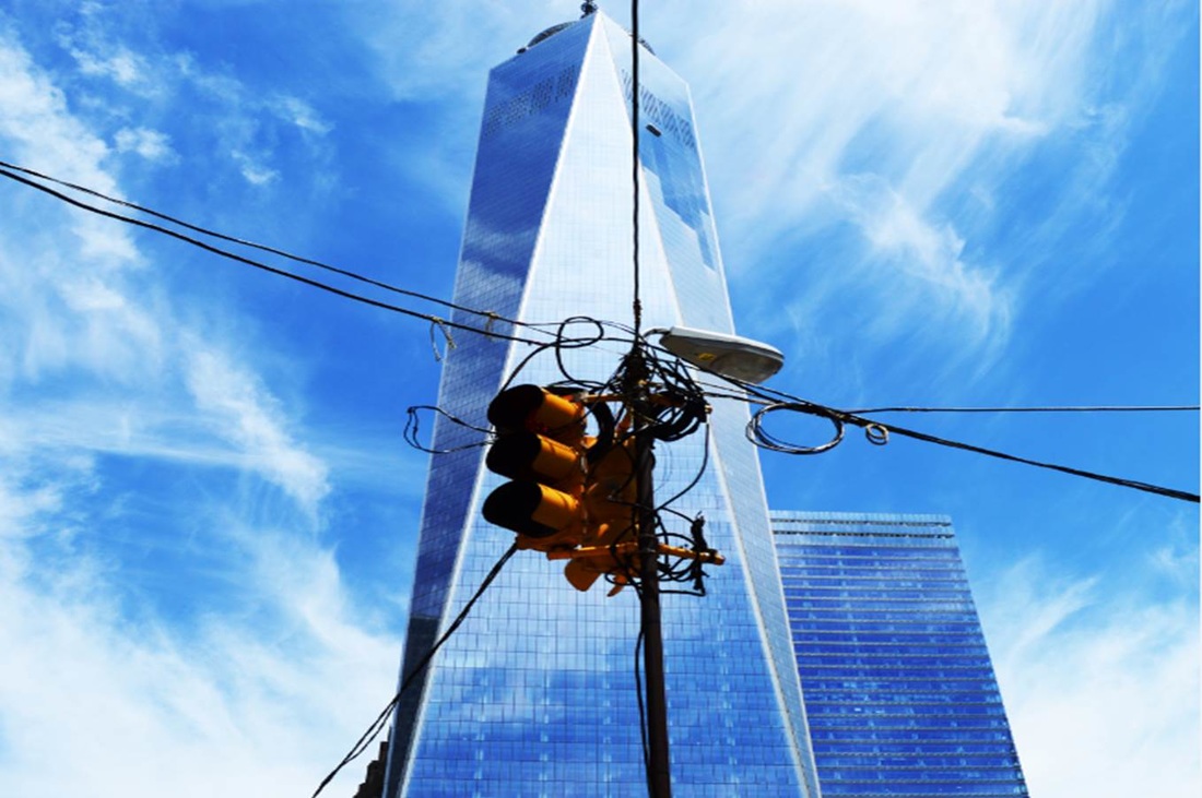
But I took this bizarre traffic to my advantage once because we were at the crossing for a long time. I took this sky scraper photo with a yellow traffic light in the middle of the photo. The traffic light had many wires coming from it making it look very over worked. The photo consists of a very blue colour scheme with one dash of bright yellow from the traffic light which compliments it very well and I would class it as a very well taken and edited vibrant photo. I’m not much of a vibrant photographer myself so I was proud I captured something different.
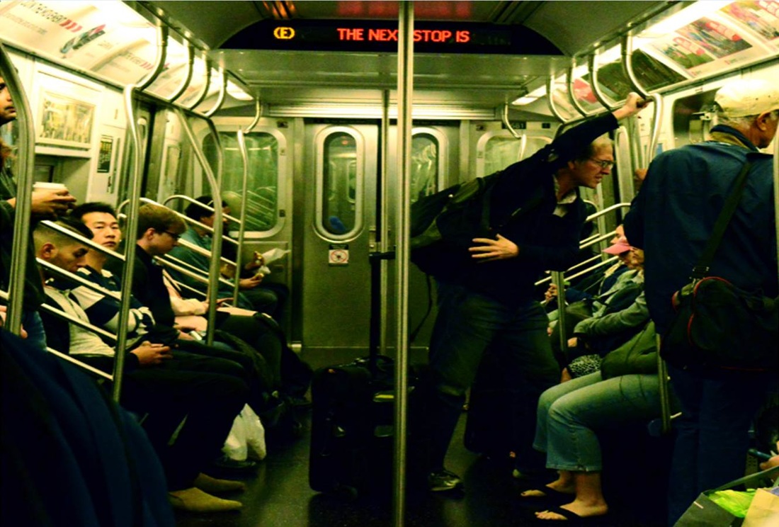
The photograph I took on the subway is in my favourites since I really like how I edited it to have a different colour within it. With only slight changes I've made the photo have the green metallic colour. The thing I like the most about this photo is how atmospheric it is and that's one of my aims for when I take a photo. And not many people are paying attention other than ONE man so I like this. What I've captured here is what I aim for with every photo I take.
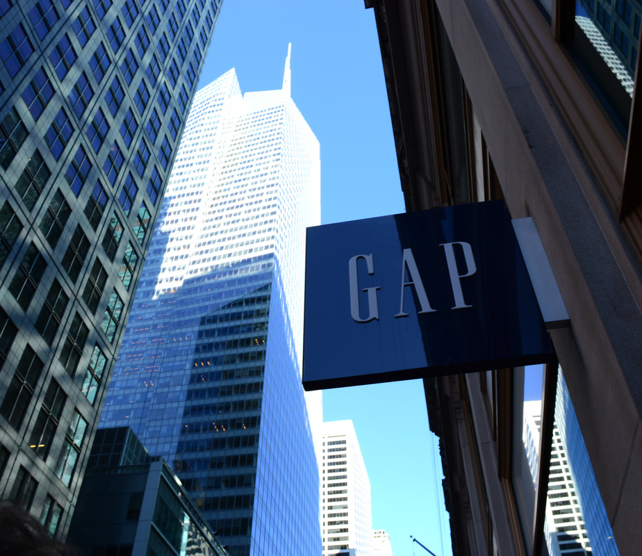
The GAP photo I took was a favourite of mine because I thought it looked very stylish and trendy. With the shiny, reflective GAP sign added with the amazing skyscraper, looming over every thing vastly in the background. When I looked at it I thought "um did I really take this?" because I never thought I would be able to take a photo like this and still have it crisp clear and be nice to look at. I think it has a very well used gradient with the light to dark in the background to the foreground. I think New York has some spellbinding architecture; maybe because I've never seen such vast buildings all around me before. So with every photo it has a chance of still looking good and usable for a photo shoot. NY is a brilliant place I would say for photography like mine.
Recording edits:
(In slideshow order)
Edit 1: This photo was a test photo before I fully started taking photos. All I did was turn the photo black and white. I experimented with the black and white tool, mixing around with the tones of the colours. I played around with the exposure and gamma control to mix dark shades with light.
Edit 2: Only slight changes with this one. I decreased the vibrancy and gave it a calm looking tone because the colours in this photo weren't that important to the photo
Edit 3: In this photograph I noticed I had the taxis to work with (their colours). So, with the red and yellow I could work with and the perfect lighting I luckily got, I mixed around with the colour balance to give this photo a sunset like tone. I made sure I didn't increase the exposure or brightness too much so people can still see the colours and street.
Edit 4: This photograph was taken by a lucky chance when I was only testing out my camera. It only needed a black and white filter and a couple of brightness changes so the woman's (priceless) facial expression could be brought out more. Her facial expression is what amused me most about photograph so that's what I wanted to focus on.
Edit 5: Also another lucky photograph taken in NY's Subway. The photo however wasn't as effective and clear like the others. Although I liked the subject of the photo so I wanted to edit it enough so it looks good to put in my exam work. I only used some light colour balance changes and brightness/contrast editing to make the photo look a little more appealing.
Edit 6: One of my all-time favourites and is an example of what I want to produce in my photography. I used colour balance to my advantage in this photo and gave the chrome texture a more light emerald colour to maybe change the atmosphere more?
Edit 7: Not much to this photograph. It appeals to me because its a snapshot of everyday life. I only used very minimal edits to change it a. I used colour balance changes to make the photograph look a little warmer and the usual brightness/contrast changes.
Edit 8: This photo mainly had brightness/contrast and vibrancy changes. Now when I look at it, maybe I might've made the photo a little brighter and less contrasted.
Edit 9: I think the black and white I changed this photo to adds to the texture in a way and the lighting effect. By not making the photo too bright I think I have achieved the texture in the buildings to be seen.
Edit 10: This wasn't an effective photo as it was very grainy and not clear enough but it got the point of my theme so I wanted to add it. I changed it to black and white to give it some style.
Edit 11: This photo had colour balance changes and exposure changes to achieve the reflectiveness on the building.
Edit 12: I just increased the vibrancy but not too much editing. (This photo was just for fun).
Edit 13: Also one of my big favourites of my NY photo shoot. I used colour balance, vibrancy, exposure and brightness/contrast changes in this photo. I think the colour balance really complimented the blue so it really showed off the lovely colour in the photograph. I cropped it also so it had a rectangle shape.
Edit 14: This edit only had very few minor edits. It's not as strong as I wanted it to be but it needed some vibrancy editing.
Edit 15: Not as strong as I wanted it to be (composition wise and clearness wise) so very minor changes. Vibrancy changes and brightness changes.
Edit 16: Used lasso tool to select coloured section. Doubled the layer and turned one black and white to use the colour splash effect.
Edit 17: In the favourites list of mine. Not many changes. Used a black and white filter, changed the exposure/gamma control and brightness/contrast. Texture and lighting complete the picture.
Edit 18: Used a black and white filter and brightness/contrast changes.
Edit 19: Colour balance changes, vibrancy, brightness/contrast, exposure tools used.
Edit 20: Colour balance adjustments. Exposure/gamma control, brightness/contrast changes to give the figure a silhouette.
Edit 21: Colour balance changes including brightness/contrast adjustments.
Edit 22: Colour balance changes to give it a warm feel. And brightness/contrast changes with exposure.
Edit 23: Vibrancy adjustments to bring out the graphics within the photohraph. And brightness/contrast changes/
Edit 24: One of my favourites. Edited only a little bit to look clearer and more vibrant.
Edit 25: Used colour balance to make the photo look more blue. Brightness/contrast. One of my favourites.
Edit 26: Used a black and white filter then adjusted the exposure/gamma control and brightness/contrast to bring out the figures silhouette.
Edit 27: Used a black and white filter. And changed the brightness/contrast.
Edit 28: Used a black and white filter. And changed the brightness/contrast
Edit 29: Used colour balance tool to give it a filtered look. Adjusted brightness/contrast.
Edit 30: Used the colour balance tool a lot to change the filter. Changed the exposure/gamma control and brightness/contrast.
Edit 31: Changed the brightness/contrast and colour balance.
Edit 32: Only changed the vibrancy a little to bring out the graphics in the photo. Also brightness/contrast changes.
Edit 33: Colour balance changes, brightness/contrast and exposure/gamma control adjustments.
Disclaimer: I wasn't told I had to record my editing in screenshots so I have done my best in typing up what I did to every single edit I did.
While in New York it was very busy and we were dragged around a lot to so many different places. So it was pretty hard to get the perfect, crisp photo I wanted. It was even weirder when I was taking photos on the subway because people think you’re a creepy, annoying tourist.
New York had human traffic and this was something that amazed me yet, annoyed me since there must be way too many people to be this bad and have HUMAN TRAFFIC.
But I took this bizarre traffic to my advantage once because we were at the crossing for a long time. I took this sky scraper photo with a yellow traffic light in the middle of the photo. The traffic light had many wires coming from it making it look very over worked. The photo consists of a very blue colour scheme with one dash of bright yellow from the traffic light which compliments it very well and I would class it as a very well taken and edited vibrant photo. I’m not much of a vibrant photographer myself so I was proud I captured something different.
The photograph I took on the subway is in my favourites since I really like how I edited it to have a different colour within it. With only slight changes I've made the photo have the green metallic colour. The thing I like the most about this photo is how atmospheric it is and that's one of my aims for when I take a photo. And not many people are paying attention other than ONE man so I like this. What I've captured here is what I aim for with every photo I take.
The GAP photo I took was a favourite of mine because I thought it looked very stylish and trendy. With the shiny, reflective GAP sign added with the amazing skyscraper, looming over every thing vastly in the background. When I looked at it I thought "um did I really take this?" because I never thought I would be able to take a photo like this and still have it crisp clear and be nice to look at. I think it has a very well used gradient with the light to dark in the background to the foreground. I think New York has some spellbinding architecture; maybe because I've never seen such vast buildings all around me before. So with every photo it has a chance of still looking good and usable for a photo shoot. NY is a brilliant place I would say for photography like mine.
Recording edits:
(In slideshow order)
Edit 1: This photo was a test photo before I fully started taking photos. All I did was turn the photo black and white. I experimented with the black and white tool, mixing around with the tones of the colours. I played around with the exposure and gamma control to mix dark shades with light.
Edit 2: Only slight changes with this one. I decreased the vibrancy and gave it a calm looking tone because the colours in this photo weren't that important to the photo
Edit 3: In this photograph I noticed I had the taxis to work with (their colours). So, with the red and yellow I could work with and the perfect lighting I luckily got, I mixed around with the colour balance to give this photo a sunset like tone. I made sure I didn't increase the exposure or brightness too much so people can still see the colours and street.
Edit 4: This photograph was taken by a lucky chance when I was only testing out my camera. It only needed a black and white filter and a couple of brightness changes so the woman's (priceless) facial expression could be brought out more. Her facial expression is what amused me most about photograph so that's what I wanted to focus on.
Edit 5: Also another lucky photograph taken in NY's Subway. The photo however wasn't as effective and clear like the others. Although I liked the subject of the photo so I wanted to edit it enough so it looks good to put in my exam work. I only used some light colour balance changes and brightness/contrast editing to make the photo look a little more appealing.
Edit 6: One of my all-time favourites and is an example of what I want to produce in my photography. I used colour balance to my advantage in this photo and gave the chrome texture a more light emerald colour to maybe change the atmosphere more?
Edit 7: Not much to this photograph. It appeals to me because its a snapshot of everyday life. I only used very minimal edits to change it a. I used colour balance changes to make the photograph look a little warmer and the usual brightness/contrast changes.
Edit 8: This photo mainly had brightness/contrast and vibrancy changes. Now when I look at it, maybe I might've made the photo a little brighter and less contrasted.
Edit 9: I think the black and white I changed this photo to adds to the texture in a way and the lighting effect. By not making the photo too bright I think I have achieved the texture in the buildings to be seen.
Edit 10: This wasn't an effective photo as it was very grainy and not clear enough but it got the point of my theme so I wanted to add it. I changed it to black and white to give it some style.
Edit 11: This photo had colour balance changes and exposure changes to achieve the reflectiveness on the building.
Edit 12: I just increased the vibrancy but not too much editing. (This photo was just for fun).
Edit 13: Also one of my big favourites of my NY photo shoot. I used colour balance, vibrancy, exposure and brightness/contrast changes in this photo. I think the colour balance really complimented the blue so it really showed off the lovely colour in the photograph. I cropped it also so it had a rectangle shape.
Edit 14: This edit only had very few minor edits. It's not as strong as I wanted it to be but it needed some vibrancy editing.
Edit 15: Not as strong as I wanted it to be (composition wise and clearness wise) so very minor changes. Vibrancy changes and brightness changes.
Edit 16: Used lasso tool to select coloured section. Doubled the layer and turned one black and white to use the colour splash effect.
Edit 17: In the favourites list of mine. Not many changes. Used a black and white filter, changed the exposure/gamma control and brightness/contrast. Texture and lighting complete the picture.
Edit 18: Used a black and white filter and brightness/contrast changes.
Edit 19: Colour balance changes, vibrancy, brightness/contrast, exposure tools used.
Edit 20: Colour balance adjustments. Exposure/gamma control, brightness/contrast changes to give the figure a silhouette.
Edit 21: Colour balance changes including brightness/contrast adjustments.
Edit 22: Colour balance changes to give it a warm feel. And brightness/contrast changes with exposure.
Edit 23: Vibrancy adjustments to bring out the graphics within the photohraph. And brightness/contrast changes/
Edit 24: One of my favourites. Edited only a little bit to look clearer and more vibrant.
Edit 25: Used colour balance to make the photo look more blue. Brightness/contrast. One of my favourites.
Edit 26: Used a black and white filter then adjusted the exposure/gamma control and brightness/contrast to bring out the figures silhouette.
Edit 27: Used a black and white filter. And changed the brightness/contrast.
Edit 28: Used a black and white filter. And changed the brightness/contrast
Edit 29: Used colour balance tool to give it a filtered look. Adjusted brightness/contrast.
Edit 30: Used the colour balance tool a lot to change the filter. Changed the exposure/gamma control and brightness/contrast.
Edit 31: Changed the brightness/contrast and colour balance.
Edit 32: Only changed the vibrancy a little to bring out the graphics in the photo. Also brightness/contrast changes.
Edit 33: Colour balance changes, brightness/contrast and exposure/gamma control adjustments.
Disclaimer: I wasn't told I had to record my editing in screenshots so I have done my best in typing up what I did to every single edit I did.
London Trek
Analysis
At first I thought this photo shoot wasn’t effective because some of the photos looked quite tourism like. But when I started editing certain photographs I noticed that this photo shoot was effective and judged it too quickly. When I was taking these photos I was intending to capture small bits of everyday life in London to appreciate. Some people who live in certain parts of London are so used to the amazing architecture and commotion around them that sometimes it irritates them. Stopping and looking at a manipulated photo of something they walk past everyday can make someone appreciate the kind of place they live in for a brief moment.
I took my photo shoot with a Nikon D1500 SLR and just walked around London all day capturing things I thought could make potential photographs. Sometimes even the best ones are accidents.
The work of Nicholas Goodden gave my inspiration and motivation a kick start. His photos were just what I was looking for in terms of reality but with style. I love how his photographs are life based and that is what I want mine to be like. When capturing life and its people; you’ve got to have courage. And in courage, I mean walking up to someone photogenic and ask to take a photograph of them just…behaving naturally. It’s hard for the photographer to walk up to a complete stranger and for that stranger to act ‘naturally’. I admire how well this photographer has done in taking natural pictures of people he most likely doesn’t know, to capture portions of reality.
The compositions within my photographs could be better. But I think they are satisfactory for me. However, getting the correct angle you want when walking around in the hustle and bustle of London is probably the most difficult thing I’ve done when out in the field to get my photographs. When editing, I stick to this rule. If I have a photo with a crowd within it, I will crop it down to reveal the people who are clearer in the photograph to capture a variety of faces. When I have a photo of a single person, I tend to crop that photo in the shape of a square and really focus on the figure in the photograph.
In my photographs, you will definitely see a trend of line due to the urban themes demonstrated with all the streetscapes. However in some cases the line is harder to spot.
In my photo shoots, I use black and white a lot. I only use colour if the colours inside the picture are to my liking and would make an impact. Black and white can save ruined photographs. Whether it be slightly faded or just not interesting enough. But when you still want to include the photo, you can switch the black and white tool. Then you adjust the shades of the colours and then the photo changes dramatically depending how ruined it is. I think black and white saves a broken photo because many people picture black and white as a stylish filter and is a simple way to make things better without doing much. My uncle who is a photographer also told me this.
In order to refine and develop my photoshoots further is add change my theme up a little. I need to add a little more meaning to my photo shoots to add a more creative touch. However I really do like my ‘Fragments of Life’ ‘Urban Jungle’ themes. So in order to make them better I need to work on my compositions more and use them to make my photographs more effective and look more professional. Other than just looking up at a building and snapping a shot of it.
Recording edits:
(In slideshow order)
Edit 1: Vibrancy/saturation changes. Brightness/contrast edited.
Edit 2: Vibrancy changes. Brightness/contrast edited.
Edit 3: Brightness/contrast edited. Colour balanced adjusted.
Edit 4: Overly edited to have an artwork like effect. Black and white filter added along with Gamma control/exposure and brightness/contrast changes.
Edit 5: Brightness/contrast edited slightly. Black and white filter added. Slight offset added.
Edit 6: Brightness/contrast edited slightly. Colour balance tool used to adjust and bring out the colours within the photograph. Very little offset.
Edit 7: Brightness/contrast edited quite greatly. Exposure used and used colour balance tool slightly to bring out the red.
Edit 8: Black and white filter added. Brightness/contrast changed.
Edit 9: Black and white filter added. Adjusted brightness/contrast and exposure/gamma/offset.
Edit 10: Black and white filter added. Adjusted brightness/contrast and the offset.
Edit 11: Black and white filter added. Brightness/contrast edited.
Edit 12: (Disclaimer: Weebly has stretched this photo and I cannot to anything about it.) Vibrancy/saturation edited along with brightness/contrast changes and exposure editing to make the picture shine.
Edit 13: Brightness/contrast changed. Black and white filter added.
Edit 14: Brightness/contrast tool only slightly used. Black and white filter slightly over done with experimenting with the tones.
Edit 15: (One of my favourites) Brightness/contrast used and exposure to fully show light within the photograph. Black and white filter added.
Edit 16: Black and white filter added. Brightness/contrast changed slightly.
Edit 17: Black and white filter used along with brightness/contrast changes and exposure adjustments.
Edit 18: Colour balance tool used to give the photo a cold, golden –like look. Brightness/contrast editing and exposure/gamma control adjustments.
Edit 19: Black and white filter added. Brightness/contrast changes and exposure/gamma control adjustments.
Edit 20: Colour balance tool used to bring out the sunlit scene. Brightness/contrast changes along with slight exposure adjustments.
Edit 21: Colour balance tool used to bring out the sunlit scene. Brightness/contrast changes (a little bit lighter on this one) along with slight exposure adjustments.
Edit 22: Black and white filter added with brightness/contrast changes. Exposure and offset tools used.
Edit 23: Colour balance tool used to bring out the sun in the time of day (early evening.) Brightness/contrast tools used.
Edit 24: Brightness/contrast tool used. Exposure changes and colour balance adjustments to bring out the suns hue.
Edit 25: Brightness/contrast changes. Exposure/gamma control adjustments along with colour balance tool editing.
Edit 26: Black and white filter added with brightness/contrast changes and exposure/offset adjustments.
Edit 27: Colour balance tool used with brightness/contrast adjustments.
Edit 28: Black and white filter added with brightness/contrast changes and exposure/gamma control adjustments.
Edit 29: Vibrancy/saturation changes. Brightness/contrast edited and exposure/gamma control adjustments. And used colour balance tool to bring out the sunset hues.
Edit 30: Vibrancy/saturation changes. Brightness/contrast edited and exposure/gamma control adjustments. And used colour balance tool to bring out the sunset hues.
Edit 31: Black and white filter added. Brightness/contrast edited and exposure/gamma control used to show the texture within the pathway.
Edit 32: Black and white filter added. Brightness/contrast edited and exposure/gamma control used.
Edit 33: Black and white filter added. Brightness/contrast edited and exposure/offset adjusted.
Edit 34: Black and white filter added. Brightness/contrast edited and exposure/offset adjusted.
Edit 35: Vibrancy changes with brightness/contrast editing and exposure adjustments.
Disclaimer: I wasn't told I had to record my editing in screenshots so I have done my best in typing up what I did to every single edit I did.
Urban City
Analysis
In this photo shoot it is yes, another London one. Like all my other urban photo shoots, my main intention was to capture people doing their everyday things and segments of life. Nevertheless this time, I wanted to base it more on Camden Town because of its urban quirkiness. I have taken photos of Camden town before but not as many as I did in this photo shoot. I’m glad I did because Camden has got a very urban vibe to it but still is a nice place to go to and look at.
The work of Ronya Galka inspired me because their photography is very much like Nicholas Goodden’s but with a perhaps, more old vibe to it? My main aim of this theme is to take urban pictures so Ronya is one of my inspirations for some of their stunning photographs.
I find that deeper into the photo shoot and deeper into the day
I think in this photo shoot, my composition stepped up a little bit more than last time. In Photoshop CC I made sure to crop any unnecessary objects or people out of the way to focus on the most eye-catching thing within the photo to make the pictures look a little better when focussing on the main subject.
This photo shoot contained my most effective black and white photographs I’ve ever taken because recently I’ve started liking an adjustment that gives my photo a stylish look. I started using the Offset tool within the Exposure tools on Photoshop CC and I usually always apply it to my black and white photos now. I’ve noticed that if you apply the offset tool, it makes the photo less heavy and overdone. Sometimes you can get a photo with a range of different tones within it that it can be too much. So when I apply the offset tool it gives it a more cooler and calmer look. I don’t want my photos to look extremely serious and to be taken too seriously. In my past photo shoots I now noticed that some photographs look way too overdone when they don’t need to (some photos actually work well with it but some don’t.)
Another way to refine and develop this photo shoot is to get more meaningful photos. But that might change my theme so perhaps after this theme I can attempt to add a creative touch to my photography.
Recording edits:
(In slideshow order)
Edit 1: Brightness/contrast changes. Vibrancy/saturation and very slightly cropped changes.
Edit 2: Brightness/contrast changes . Added black and white filter. Adjusted exposure then added slight offset.
Edit 3: Brightness/contrast changes . Added black and white filter. Adjusted exposure then added slight offset.
Edit 4: Brightness/contrast slight changes. Black and white filter added. Adjusted exposure.
Edit 5: Brightness/contrast very slight changes. Colour balance changed. Offset filter very slightly added.
Edit 6: Brightness/contrast changed. Black and white filter added. Exposure and offset adjusted very slightly.
Edit 7: Brightness/contrast changed. Black and white filter added. Exposure and offset adjusted very slightly.
Edit 8: Brightness/contrast changed. Black and white filter added. Offset adjusted.
Edit 9: Brightness/contrast changed. Black and white filter added. Gamma control and exposure adjusted.
Edit 10: Brightness/contrast changed. Black and white filter added. Gamma control, exposure and offset adjusted.
Edit 11: Brightness/contrast changed. Black and white filter added. Exposure edited.
Edit 12: Colour balance changed to give a very sunlit picture. Brightness/contrast and exposure changed.
Edit 13: Colour balance changed greatly. Vibrancy/saturation adjustments along with exposure changes.
Edit 14: Brightness/contrast changed. Black and white filter added. Exposure and offset adjusted.
Edit 15: Brightness/contrast changes. Colour balance adjusted to give sunlit hue. Exposure changed.
Edit 16: Vibrancy/saturation changes. Brightness/contrast adjustments. Exposure/gamma control edits and used colour balance tool.
Edit 17: Brightness/contrast changed. Black and white filter added. Exposure and offset adjusted very slightly.
Edit 18: Vibrancy/saturation changed. Brightness/contrast edits. Added offset and adjusted exposure.
Edit 19: (Disclaimer: Weebly stretched the photo out. And I cannot do anything about it.) Colour balance used to give photo a vintage look. Brightness/contrast edits and vibrancy changes.
Edit 20: Brightness/contrast changed. Black and white filter added. Exposure, offset and gamma control adjusted very slightly.
Edit 21: Used lasso tool to select coloured area. Added a new layer and turned one layer black and white and kept the other (selected area) coloured. Giving us the colour splash effect. Along with vibrancy and colour balance changes.
Disclaimer: I wasn't told I had to record my editing in screenshots so I have done my best in typing up what I did to every single edit I did.
